You spent months building your app. You tested it, launched it, pushed it to the stores, and started getting downloads. Then you looked at your analytics and noticed something uncomfortable — a huge percentage of users open the app once and never come back. Some don't even make it past the first screen.
This is not a niche problem. Industry data consistently shows that most apps lose the majority of their new users within the first session. The downloads look great. The retention does not.
The reason is almost always design — not in the artistic sense, but in the functional sense. The way your app communicates, guides, and responds to a new user in those critical first moments determines whether they stay or leave. Here's what's actually going wrong, and how to fix it.
The First Screen Sets the Tone for Everything
When someone opens your app for the first time, they make a judgment call within seconds. Is this worth my time? Do I understand what I'm supposed to do here? Does this feel like a quality product?
If the answer to any of those questions is unclear or negative, they leave. Not because your app is bad — but because it failed to communicate its value fast enough.
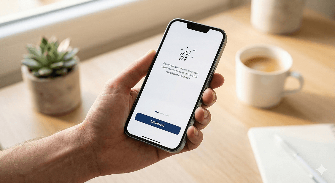
The first screen of your app should do three things immediately: tell the user what the app does, show them that it's easy to use, and give them one clear action to take. That's it. Not five features. Not a terms and conditions agreement. Not a mandatory account creation before they've seen anything of value.
Every element you put between a new user and their first moment of value is a potential exit point.
Forced Sign-Up Before Showing Any Value
This is one of the most common and most damaging mistakes in app design. A user downloads your app, opens it, and immediately hits a wall — create an account to continue. They haven't seen what the app does yet. They have no reason to trust you with their email address. So they close it.
The fix is to let users experience the core value of your app before asking for anything in return. Show them what the product does. Let them browse, explore, or try a feature. Once they've had that moment — once they understand why the app is worth their time — asking for an account makes sense and conversion rates go up dramatically.
Onboarding That Explains Too Much at Once
A lot of app onboarding flows are essentially instruction manuals squeezed into five slides. By slide three, the user has stopped reading. By slide five, they've forgotten slide one. And then they arrive at the actual app feeling overwhelmed rather than ready.
Good onboarding doesn't explain everything upfront. It introduces one concept at a time, in context, exactly when the user needs it. A tooltip that appears when a feature becomes relevant. A subtle highlight on the next logical action. A short prompt that appears after a user completes their first task.
This approach — called contextual onboarding — respects the user's time, reduces cognitive load, and results in significantly better retention than the traditional walkthrough model.
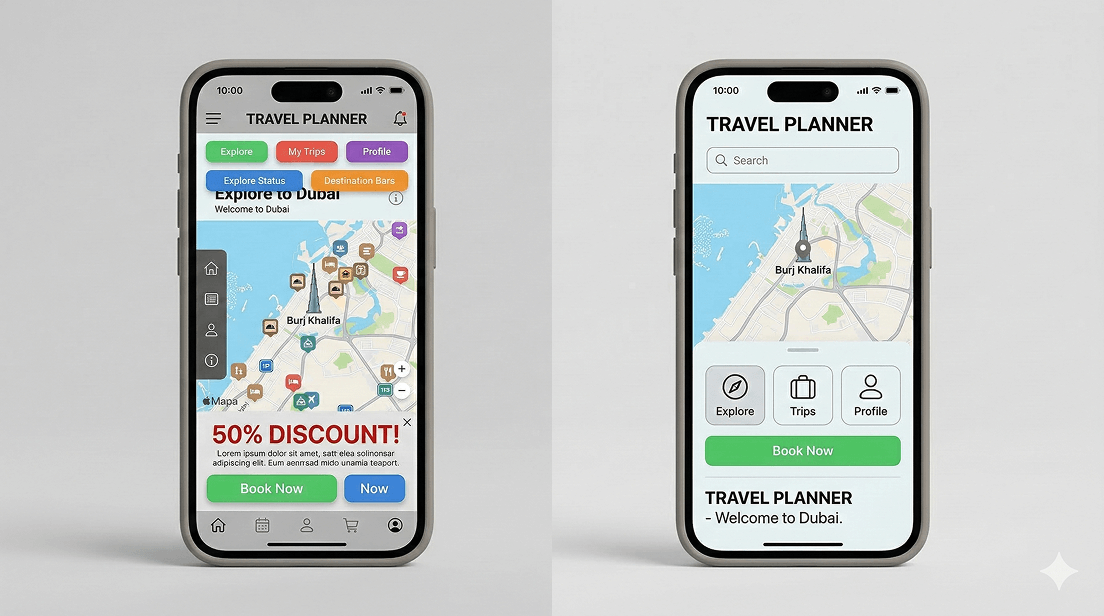
Unclear Navigation and Layout
If a user can't figure out where to go next within the first few seconds, they won't spend time working it out. They'll leave. Navigation in a mobile app needs to be instinctive — built around how people naturally think and move, not around how the development team structured the backend.
Common navigation mistakes that drive abandonment:
- Too many options in the main menu with no clear hierarchy
- Icons without labels that require guessing
- Important actions buried behind multiple taps
- Back button behavior that doesn't match user expectations
- No visual feedback when something is tapped or loading
Each of these creates a moment of friction. One moment of friction might be forgiven. Several in a row, and the user is gone.
Slow Load Times Within the App
Speed inside the app matters just as much as speed on a website. If switching between screens takes two or three seconds, if images take a moment to appear, if actions feel laggy — users interpret this as the app being broken or low quality, even if technically everything is working.
Perceived performance is as important as actual performance. Skeleton screens, loading animations, and optimistic UI updates — where the interface responds immediately even before the server confirms the action — all make an app feel faster and more responsive than it might technically be.
Visual Design That Doesn't Feel Trustworthy
People judge quality by appearance, especially in the first session. An app that looks dated, inconsistent, or unpolished signals to the user that the product behind it might also be unreliable. This is particularly relevant in the UAE market, where users are exposed to high-quality international apps daily and have a calibrated sense of what professional looks like.
Consistent typography, a coherent color system, well-spaced layouts, and high-quality icons and imagery all contribute to a first impression of trustworthiness. This isn't about making the app look fancy. It's about making it look considered — like someone put real thought into every screen.
No Personalisation or Relevance Signal
Users are more likely to stay when the app feels like it was made for them specifically. A generic experience that could belong to any user in any country gives people no reason to feel connected to the product.
Even simple personalisation goes a long way. Greeting the user by name after sign-up. Showing content or recommendations relevant to their location or preferences. Remembering where they left off. These small signals communicate that the app is paying attention — and that makes users more likely to come back.
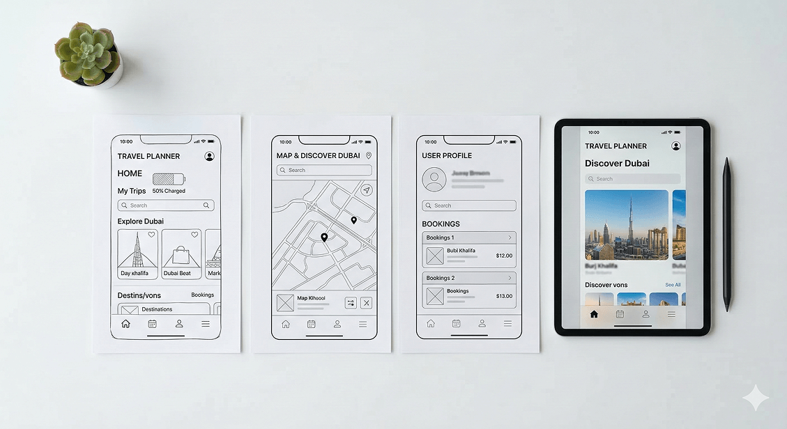
What Good Design Actually Looks Like in Practice
Fixing these issues isn't about redesigning everything from scratch. It starts with understanding where users are dropping off, why, and what small changes have the biggest impact. That process looks like this:
- User testing with real people who match your target audience
- Analytics review to identify the specific screens and moments where drop-off spikes
- Heatmaps and session recordings to see how users are actually interacting with your interface
- Iterative design changes tested against real user behavior, not assumptions
The best-designed apps in the world didn't get that way on the first try. They got that way through a consistent process of observing real users, identifying friction, and removing it — one decision at a time.
The 30-Second Rule
Think of your app's first 30 seconds as the most valuable real estate in your entire product. Every design decision in that window either earns the user's trust or loses it. Clear value communication, frictionless entry, fast performance, and an interface that feels immediately familiar — these aren't nice-to-haves. They are the difference between an app that grows and one that leaks users faster than marketing can replace them.
If you haven't sat down recently and watched a new user open your app for the very first time, that's the single most useful thing you can do today. You'll learn more in ten minutes of observation than in hours of internal discussion.
Is your app losing users before they even get started?
At Joyboy, we design interfaces that make first impressions count. From onboarding flows to interaction design, we build experiences that keep users engaged from the very first second. See how we approach UI/UX design.