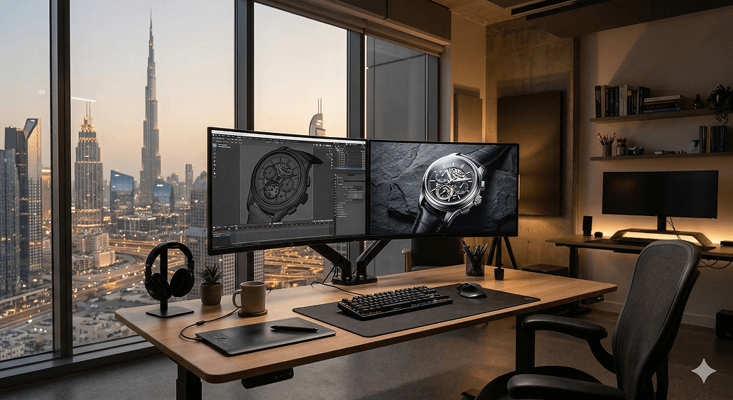
The design process used to have a predictable shape. A brief comes in, a designer opens Figma, spends several hours building wireframes from scratch, presents them for feedback, iterates, moves to high-fidelity screens, iterates again, and eventually hands off a completed design to development. Weeks, sometimes.
That shape has changed fundamentally. Teams using AI UI tools in 2026 are shipping features 40 to 60 percent faster than those still wireframing manually — and the quality gap has closed to the point where AI-generated designs often require only minimal refinement before they're production-ready.
The two tools driving most of that change in professional design workflows are UX Pilot and Figma AI. They're not competitors — they're complements. UX Pilot generates, validates, and prepares designs with research-driven AI capabilities. Figma AI refines, iterates, and prototypes within the design environment your team already lives in. Together, they cover the full design workflow from first idea to development-ready specs.
This guide walks through exactly how to use both tools together — step by step, with real prompts and practical workflow decisions — to produce a complete app UI in a fraction of the time the traditional process takes.
Understanding the Two Tools Before You Start
UX Pilot is an AI-powered design platform that generates wireframes, high-fidelity UI screens, screen flows, and design documentation from text prompts. What differentiates UX Pilot from pure generation tools is its validation layer — predictive heatmaps that simulate where users will focus attention before you run actual usability tests, and a Design Review Bot that catches accessibility issues, contrast problems, and layout inconsistencies automatically.
UX Pilot reduces concept-to-implementation time by up to 80 percent. It generates flexible designs that match your exact requirements instead of generic templates, and its AI assistant enables everyone on your team — designers, developers, and stakeholders — to contribute effectively to the UX process.
UX Pilot works in tandem with your existing design system in Figma. With the plugin, you can not only export designs to Figma but also import your existing components to create a custom model that understands your design language — meaning every screen it generates follows your established patterns, colors, buttons, and typography.
Figma AI — specifically Figma Make — is Figma's built-in AI suite for generating UI layouts, interactive prototypes, and design system components directly within your Figma workspace. The AI features are accessible through the action button at the bottom of your Figma interface or by pressing Cmd+K (Mac) or Ctrl+K (Windows).
As of March 2026, Figma's MCP server allows GitHub Copilot users to push rendered UI to the Figma canvas as editable frames and pull design context from Figma into code — creating a two-way bridge between design and development that didn't exist a year ago.
The workflow covered in this guide uses UX Pilot for initial generation and validation, then Figma AI for refinement, prototyping, and developer handoff.
Step 1: Sign Up for UX Pilot and Understand the Credit System
Go to uxpilot.ai and create a free account. No credit card is required.
The free plan gives you 90 one-time credits — approximately 15 screens — with access to HiFi UI generation, wireframes, design reviews, and predictive heatmaps. This is enough to evaluate the tool properly and complete a small project before committing to a paid plan.
Paid plans:
- Standard ($12/month billed annually): 420 credits (approximately 70 screens), Figma export, code export, up to 5-screen flows, commercial rights
- Pro ($22/month billed annually): 1,200 credits (approximately 200 screens), unlimited screen flows, image-to-design, section editing, deep export capabilities
- Teams: Custom limits and support — contact UX Pilot sales for pricing
Credits are consumed when you generate UIs, wireframes, flows, design reviews, and heatmaps. Lower-level plans have all the core features — higher plans give you more capacity and advanced tools. You don't lose capabilities as you move down, just headroom.
For a complete app UI with 10 to 15 screens, the Standard plan at $12/month is sufficient. For agencies running multiple projects simultaneously, Pro makes more sense.
Step 2: Define Your App Brief Clearly Before Generating Anything
The quality of AI-generated design output is directly proportional to the quality of the brief you provide. Five minutes spent on a clear brief saves multiple revision rounds.
For this walkthrough, we'll design a food delivery app for the UAE market. Write your brief with these elements:
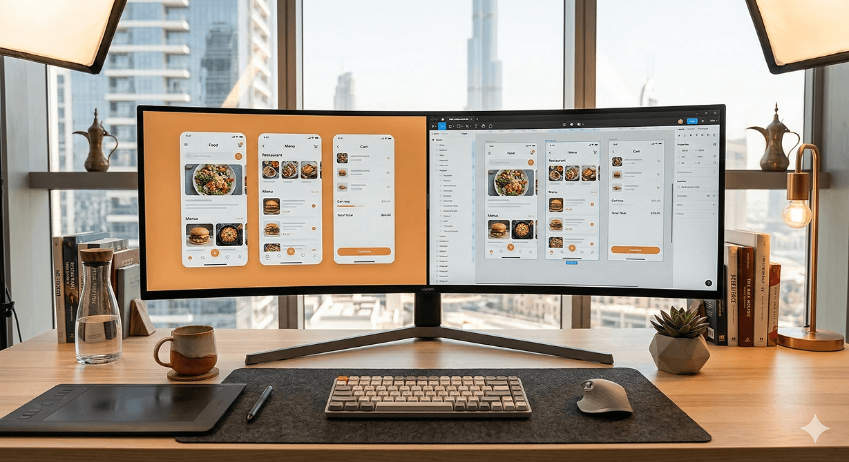
App name and purpose: A food delivery app called "Delivr" for UAE customers to order from local restaurants.
Target user: UAE residents aged 25–45, primarily mobile users, Arabic and English speakers.
Core screens needed:
- Onboarding/splash screen
- Home screen with featured restaurants and categories
- Restaurant listing page
- Restaurant detail page with menu
- Cart screen
- Checkout and payment screen
- Order tracking screen
- Profile and order history screen
Visual direction: Modern, clean, warm tones. Primary color: deep orange (#FF6B35). Secondary: warm white (#FAFAFA). Dark mode optional.
Platform: iOS-first, Android parity.
Having this written down before you open UX Pilot means your prompts will be specific enough to generate screens that actually match your vision rather than a generic food app template.
Step 3: Generate Wireframes in UX Pilot
Log in to UX Pilot and click AI Wireframe Generator from the main dashboard.
UX Pilot generates flexible wireframes for desktop and mobile from design requirements in seconds — these are low-fidelity structural layouts that establish the information hierarchy and user flow before visual design decisions are made.
Enter your first prompt:
UX Pilot will generate the wireframe in seconds. Review the structure — is the information hierarchy correct? Is the navigation logical? Are all the required elements present?
If anything needs adjustment, use the chat interface to refine:
Repeat this for each screen in your list. Wireframes are fast to generate and cheap on credits — use this phase to lock down the structure of every screen before moving to high-fidelity.
Step 4: Generate High-Fidelity Screens
With wireframes approved, switch to AI UI Generator in UX Pilot. This is where the visual design gets generated.
Click New Design and enter your first high-fidelity prompt:
UX Pilot generates multiple design variations. Review each one — if a variation captures the right feel but needs adjustments, select it and use the chat to refine specific sections rather than regenerating from scratch.
Work through all 8 screens using the same approach — specific prompt per screen, refine with chat, approve before moving on. For a complete 8-screen app, budget approximately 45 to 60 minutes for this stage on a first pass.
Step 5: Run Predictive Heatmap Validation
This is UX Pilot's most distinctive capability — and one that most designers skip because they don't realise it exists.
UX Pilot's predictive heatmaps simulate where users will focus their attention on a screen before you run actual usability tests. This AI-powered validation helps teams test assumptions early instead of discovering problems post-launch.
Select your home screen design and click Predictive Heatmap. UX Pilot will generate a heat map overlay showing where users' eyes are predicted to go first, where attention concentrates, and which areas are likely to be overlooked.
Review the heatmap against your design intent. On your home screen:
- Is the search bar getting enough attention? It should be a high-heat area.
- Are the featured restaurant cards drawing focus? They should.
- Is the bottom navigation bar registering? It should be moderate heat.
- Are there important elements in cold zones that users are likely to miss?
If the heatmap reveals issues — a CTA button in a cold zone, a critical piece of information being overlooked — adjust the layout and run the heatmap again. This validation step, done before any development work, prevents usability problems that would be significantly more expensive to fix later.
Step 6: Run the Design Review Bot
Before exporting anything to Figma, run UX Pilot's automated design review.
The Design Review Bot catches accessibility issues, contrast problems, and layout inconsistencies automatically — this research-driven approach helps teams validate assumptions early.
Select all your screens and click Design Review. The bot will analyse:
- Contrast ratios — Does your text meet WCAG accessibility standards? Orange text on white backgrounds can fail contrast requirements — the bot will flag this.
- Touch target sizes — Are buttons and interactive elements large enough to tap comfortably on mobile? 44x44 points is the iOS minimum.
- Consistency issues — Are you using the same button styles across screens? The same spacing values? Inconsistencies get flagged.
- Layout problems — Overlapping elements, elements too close to screen edges, content that will be cut off on smaller devices.
Work through the flagged issues before moving to Figma. Issues caught here are fixed in seconds. Issues caught after development handoff cost significantly more.
Step 7: Export to Figma
With all screens validated and reviewed, export to Figma.
UX Pilot integrates with Figma, allowing you to transfer designs between platforms or create them directly within Figma through a plugin. The Figma integration is described by users as flawless — no janky exports or compatibility issues.
Option 1 — Export from the web app: Click Export to Figma on any screen or select all screens and export in batch. UX Pilot will generate a Figma file with all screens as editable frames.
Option 2 — Use the Figma plugin: Install the UX Pilot Figma plugin from the Figma Community. With the plugin, you can import your existing Figma components to create a custom model that understands your design language — meaning every screen generated follows your established patterns.
If you have an existing Figma design system, use Option 2. Connect UX Pilot to your component library and any screens generated from this point will use your actual components rather than generic ones. For a new project without an existing system, Option 1 is faster.
Step 8: Refine in Figma Design
Once your screens are in Figma, the refinement phase begins. This is where Figma's native tools — layers, components, constraints, and auto layout — let you polish the generated designs to production quality.
Figma Design combines powerful design tools with real-time collaboration — multiple designers can work in the same file simultaneously, stakeholders can comment directly on designs, and you can build realistic prototypes to test user flows, all in one place.
Priority refinements to make:
Replace generated images with real assets. UX Pilot's generated images are placeholders — replace them with actual restaurant photos, real icons from your icon library, and brand-accurate imagery.
Apply your design system components. If your project has existing button components, card components, and navigation components, replace the generated equivalents with your actual components. This ensures your design file matches what will actually be built.
Tighten spacing and alignment. AI-generated layouts are good but not always pixel-perfect. Use Figma's alignment tools and auto layout to ensure consistent spacing throughout.
Refine typography. Check that all text styles are using your defined type scale — headings, body text, captions, labels — and that sizes, weights, and line heights are consistent.
Step 9: Use Figma AI for Rapid Iteration
With your base designs in Figma, use Figma AI to explore variations and refine specific sections quickly.
Access Figma AI through the action button at the bottom of the interface or by pressing Cmd+K (Mac) / Ctrl+K (Windows). Select First Draft from the templates — Basic App, App Wireframe, Basic Site, or Site Wireframe — enter your prompt, and use quick actions to switch themes, adjust spacing, modify border radius, or make additional prompt-based changes.
Practical Figma AI uses during refinement:
Generating alternative layouts: Select your restaurant card component and use Figma AI to generate three alternative card layouts. Compare them against your original — sometimes a generated alternative is better than your starting point.
Filling content intelligently: Instead of Lorem Ipsum, Figma AI generates texts relevant to your project. Select any text element and use the AI to generate realistic restaurant names, menu descriptions, and UI copy that makes your designs look finished rather than placeholder-filled.
Smart duplication for lists: With Smart Duplication, create multiple variations of a component in a stack — particularly useful for grids, restaurant lists, or repeated UI elements, making it easier to test different designs.
Background removal: Figma AI's built-in background remover cleans up product and restaurant images directly in Figma without needing external tools.
Renaming and organising layers: Figma AI automatically renames and organises layers — essential for keeping your file navigable for developers during handoff.
Step 10: Build an Interactive Prototype With Figma Make
With all screens refined, use Figma Make to build an interactive prototype for stakeholder review and user testing.
Figma Make is an AI-powered platform that generates interactive prototypes from natural language prompts — you describe what you want to build and Figma Make creates the complete experience including component states, interactions, user flows, and missing screens.
Open Figma Make (it's available directly from your Figma workspace) and enter:
As of January 2026, Figma Make prototypes can be embedded directly into Figma Design, FigJam, and Figma Slides — making it easy to share interactive prototypes in stakeholder presentations without sending separate links.
Share the prototype link with stakeholders and collect feedback through Figma's commenting system. Every piece of feedback is attached to the specific screen it relates to — no more feedback documents, no more ambiguity about which element a comment refers to.
Step 11: Connect to Development With the Figma MCP Server
As of March 6, 2026, GitHub Copilot users can connect to the Figma MCP server to push rendered UI to the Figma canvas as editable frames and pull design context from Figma into code — available in VS Code with Copilot CLI support coming soon.
This is a significant development for design-to-development handoff. Developers using Cursor or GitHub Copilot can now pull your Figma design context directly into their coding environment — getting accurate component specs, spacing values, and color tokens without manual inspection of the Figma file.
To set up the Figma MCP server for your development team:
Once connected, developers can ask Cursor or Claude Code questions like "What are the exact spacing values for the restaurant card component?" and get accurate answers pulled directly from the Figma file — eliminating the back-and-forth that typically slows down development.
The Full Workflow in Summary
The complete workflow — from blank brief to development-ready designs with an interactive prototype — looks like this:
- Write a clear brief (5 minutes) — app name, target user, screens needed, visual direction
- Generate wireframes in UX Pilot (15 minutes) — one prompt per screen, refine with chat
- Generate high-fidelity screens in UX Pilot (30 minutes) — detailed prompts per screen
- Run predictive heatmaps (10 minutes) — validate attention patterns, fix cold-zone issues
- Run Design Review Bot (5 minutes) — fix accessibility and consistency issues
- Export to Figma (5 minutes) — batch export or plugin
- Refine in Figma Design (30 minutes) — real assets, components, spacing, typography
- Use Figma AI for rapid iteration (15 minutes) — alternative layouts, content fill, layer naming
- Build interactive prototype with Figma Make (15 minutes) — connect screens, add interactions
- Share for feedback and connect to development (10 minutes) — MCP server setup
Total: approximately 2.5 to 3 hours for a complete, validated, prototype-ready app UI across 8 screens.
Compare that to the traditional process — 3 to 4 hours for wireframes alone — and the productivity advantage is clear. The time savings aren't coming from cutting corners. They're coming from eliminating the mechanical work that used to dominate the early stages of every design project, and redirecting that time toward the judgment, validation, and refinement that actually determines whether the design serves its users well.
The tools handle the generation. The designer handles the thinking. That combination, in 2026, produces better work faster than either approach alone.
Need a polished app UI designed and ready for development?
At Joyboy, we use UX Pilot, Figma AI, and the full modern design stack to deliver validated, production-ready UI faster than traditional workflows allow — without cutting corners on quality or user experience. Talk to us about your design project.